News . Feature Stories . Breaking down the 2016 Rio Olympics branding
News
August 16, 2016
Breaking down the 2016 Rio Olympics branding
Graphic Design faculty member Mari Hulick puts logo in perspective

The Brazilian firm Tatil created this year's look.
By Karen Sandstrom
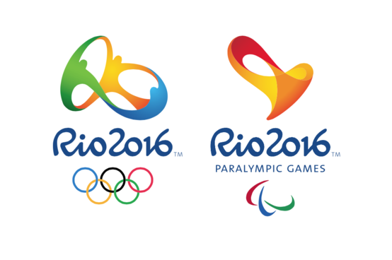
Every time the Olympics roll around, we get a brand new logo to love, hate, consider and reconsider. Feast your rods and cones on this summer’s Rio version: a swirling ring of human figures rendered in green, gold and cobalt above Rio 2016 and the ever-present Olympic rings.
“I would score it a success,” says designer Mari Hulick, associate professor in the Graphic Design Department at CIA.
With the theory that logo design is like a lot like abstract painting — the uninitiated think it’s easy — we asked Hulick to break down look of the Rio games branding. The Brazilian design firm Tatil won the job back in 2009, and reportedly went through 50 iterations to arrive at the one you see on shirts and water bottles this summer.
Starting with the graphic image or “mark,” Hulick says it conveys the energy people associate with the city of Rio. “It’s three people dancing!” she says. “It’s got this real goofy, funny almost musical feel to it. It feels like Carnivale.”
But is it too whimsical for a serious sporting event?
“Well, that’s the question,” Hulick says. She points to the London Games four years back, when the design team conjured a jagged take on the year 2012 for a logo that drew major criticism. Some observers say that the fun and flowing Rio image leans too far in the other direction. Perhaps it’s a tad too friendly for the greatest athletic event in the world. “I get that,” Hulick says. “But I always want to come back and say, ‘It’s Rio.’ “
As for the custom-designed font? “It’s a loose, open script,” Hulick says. It doesn’t have gravitas, she adds, but “I think it’s appropriate for Rio.”
All in all, the design is casual yet still sophisticated, and it plays well across platforms. The digital age creates options for brand adaptations that can point up weakness or encourage audiences to have fun. The Rio logo looks cool in animation, she points out.
“The rookie mistake with [designing] marks is not seeing them as marks,” Hulick says. “The rookie mistake is to illustrate.”
Overly complex drawings often make poor marks because they don’t communicate quickly enough or allow room for viewers the satisfaction of filling in the blanks.
“If you look at the great icons, the Nike swoosh — that is a swoosh that is filled with so much meaning by all the people who want Nikes, who buy Nikes, who support the Nike ideal,” Hulick says.
Sure, the shape itself is simple, but “being sensitive enough to come up with that, and being agile enough to listen to what your client wants to communicate, and what your audience wants — that’s what makes it difficult,” Hulick says.
New design students often assume logo making is easy, she says. “By the end of the first year, they begin to understand how hard it is,” Hulick says. “They either give up and say, ‘I don’t want to do this,’ or they get really humble.”
And in the world of contemporary branding, the job is all the much more difficult because so many constituents have a voice. In the 1950’s branding consisted of a logo that a single design guru handed off to owner or key decision maker of the business. By the 1990s, Hulick says, this had become a group effort: boards of directors, executives with MBAs, marketing departments and more became part of the process.
Today, creating a successful branding campaign has as much to do with how the design team successfully manages the process as it has to do with the team’s creativity and graphic skills.
With the Olympics, Hulick says, “it’s not only the [International Olympic Committee], now you’re getting into governments. You have city leaders, international alliances. Ultimately, when you see good branding today, you’re seeing well-managed ideas. The design team has someone who can herd the cats.”
Learn more about CIA’s Graphic Design program at cia.edu/graphicdesign.
Latest Headlines view all
-
April 02, 2024
Cleveland Institute of Art students partner with Progressive Art Collection to exhibit Ready, Set, Relay! -
March 04, 2024
Cleveland Institute of Art announces Curlee Raven Holton Inclusion Scholar Program -
November 06, 2023
Collision of art and artificial intelligence creates murky waters for artists, curators and educators
Questions?
For more information about this or other CIA news, contact us here.
Social Feed